

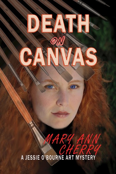
Death on Canvas
The Jessie O'Bourne Art Mysteries Book 1
by Mary Ann Cherry
Genre: Mystery
While painting on location in one of her family's hayfields, Jessie absentmindedly brushes a note of turquoise onto the canvas. Curious about what added the lovely spot of color, the artist walks over to discover a tennis shoe. The mate is still on the foot of a dying Native American girl crammed between the hay bales.
The story becomes more personal when old flame, Sheriff Russell Bonham, reveals that Amber Reynolds, a grad student writing a thesis for her art history major, was attacked while on her way to speak to Jessie's family about two missing Thomas Moran masterpieces worth millions. The paintings disappeared nearly a hundred years ago from St. Benedict's Mission School. Right after the unsolved murder of Jessie's great aunt Kate.
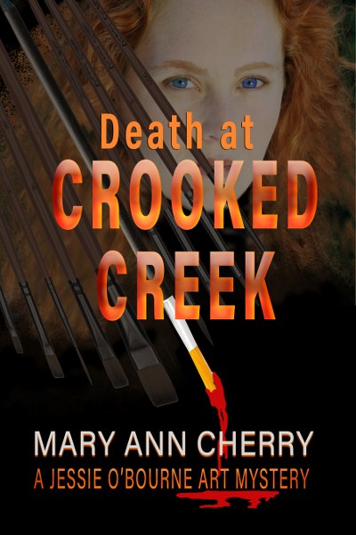
Death at Crooked Creek
The Jessie O'Bourne Art Mysteries Book 2
The massive tractor draped with the advertising banner struck prominent artist, Jessie O’Bourne, as a fun way to promote Montana’s annual Crooked Creek Art Expo—until she noticed the bullet holes in the back window. Then she heard of the tragic shooting death of a local teen. After her irascible tomcat, Jack, discovers a dead man in Jessie’s motorhome, she not only becomes a murder suspect, but begins receiving threatening notes accompanied by a toy replica of the big John Deere.
Surrounded by talented painters and sculptors, Jessie suspects one is a creative killer.

Coloring Your Book
The world is awash with color, so why not use a few creative splashes in your descriptive writing? As children, we excitedly open that new box of 64 brilliant crayons and ask friends, “What’s your favorite color?” As adults we exclaim over rainbows and fluffy white clouds and anthropomorphize color into common phrases such as “true blue” or “green with envy”. Our homes are decorated with just the right shade of harmonizing carpet and furnishings, and our wardrobes filled with clothes that match our eyes. However, many authors omit even a nuance of color when describing a character or scene. The result is a bland passage that could have sung with juicy color, but instead strikes an empty note.
Artists utilize strokes of color to lead a viewer’s eyes through a work of art or to lend importance to specific segments of the painting or to convey mood. Writers can learn these techniques as well, and they will prove themselves indispensable. In the following paragraphs are color usage tricks I teach to painting students, rewritten for use in writing. It would be a helpful self-assigned experiment to write several scenes, each one utilizing a different color tip.
The ten percent solution leads to a strong focal area. Describe your scene with approximately 90% neutral or dull colors and save the remaining ten percent “snap” of more vivid primary colors to reel the reader in. A strong color will draw the eye, and spark the memory, so be sure the snap color leads to your primary focal point. It is what the reader will carry away from the paragraph.
“…I sloshed unhappily through pelting rain and mud into the drizzly, grey nightmare. Over the girl’s body a brown makeshift tent had been erected to preserve evidence. A sea of black umbrellas sheltered those unfortunate detectives methodically working the crime scene. Beyond the perimeter a slim figure stood alone under a vivid red parasol.”
The dull colors lead to eye and begin setting the scene, the hot red draws the viewer more strongly into the story. Who is carrying the only red umbrella?
Color is weakened and cooled by white. When white is added the hue not only becomes lighter – it becomes cool in both appearance and emotional connotation. Hot colors can be red or orange but they can just as easily be simply a primary color undiluted by white. A rich blue is hotter than a pale pink, for instance. A deep cobalt blue appears stronger than a light green. What should your character wear? Use the lighter, diluted colors when you want a character or scene to feel less passionate, crisp, less dramatic or more professional.
“…she walked into the board room wearing a tailored, pale blue linen suit.”
Push color to give flavor to various scenes. Painters will often make one area of the painting richer and less important areas dull, or make an area warm and another cool. A writer can deliberately use color to help the reader visualize a new space when there is an important change of scene. In one chapter, the reader may find the heroine sitting in a dilapidated diner with orange vinyl booths. In another, the hero is diving into a pool of brilliant blue in a natural cove. These two scenes show the use of radically different locations, but also make use of color complements, or exact color opposites, adding a bit of pop without the reader being aware of why they feel the added interest. Pushing color to extremes can add some pop as well, contrasting the personalities of two characters.
“…her full silk skirt danced and swirled with all the colors of a Mexican fiesta, topped by a poppy red tank top and that outrageous head of blond hair. She looked at me over Dave’s shoulder and grinned. I stood there in my plain white dress and wanted to die. God, I hated her.”
High contrast sets a dramatic scene. In a painting, the focal area is strengthened by allowing the highest contrast of light and dark to be adjacent to each other. The stark contrast draws the eye and keeps the viewer focused on that specific area. A setting of black and white can be effective in writing as well.
“…the deepening light, and the cedars meeting over their heads, cast them into midnight blackness…Straining her eyes she saw ahead the bright white bricks of Tara.” (Gone with the Wind by Margaret Mitchell)
Unfortunately, a painter would know that the white brick in that type of light would appear a dull blue, but still, the stark contrast does paint a strong picture in the mind’s eye.
Lighting will change your colors. Light will change colors, washing out some, enhancing others, depending upon the sky and other extraneous circumstances. As in the example above, I see odd comments and errors in books because the writer forgets what type of light he used at the beginning of the scene. For instance, on a dull day a field of wheat will appear dull and dirty ochre but the writer depicts it as a mass of brilliant and burnished yellow. On a sunny day it would appear exactly so, but not in overcast. Don’t confuse your reader. Pay attention to the light.
Things that are different stand out. Advertising agencies have the use of effective color down to a science, and show outrageous images that we remember because the color is effective. That which is different will always stand out — the red umbrella in a sea of black parasols, a blue monkey, the green gecko. A reader is jolted with a splash of color, and the quirky imaginative streak in most of us appreciates the jolt.
Did you catch “the blue monkey”? There are more than sixteen million colors. Let’s use a few.
-Mary Ann Cherry

Cherry is a professional artist who writes the Jessie O'Bourne art mystery series in her elusive free time. Like her main character, she paints primarily western and wildlife subject matter, travels to art shows, and teaches workshops.
Raised in rural Montana, she now lives in Idaho with her husband and several spoiled cats.

$25 Amazon Card
Follow the tour HERE for special content and a giveaway!
#SeriesTour #Giveaway
With Guest Post
#jessieobourne #art #mystery #maryanncherry #kindleunlimited
Comments
Post a Comment